
A designer’s journey into type in mixed reality
I would like to share my journey of designing and developing Typography Insight for HoloLens. Typography Insight for HoloLens is an app that allows you to experiment and play with types in three-dimensional mixed reality space. I first published the app on iOS about five years ago and it was embraced by the design and education communities. Here is my story on how I brought the app from iOS to Windows, and from Windows to HoloLens.
My Background
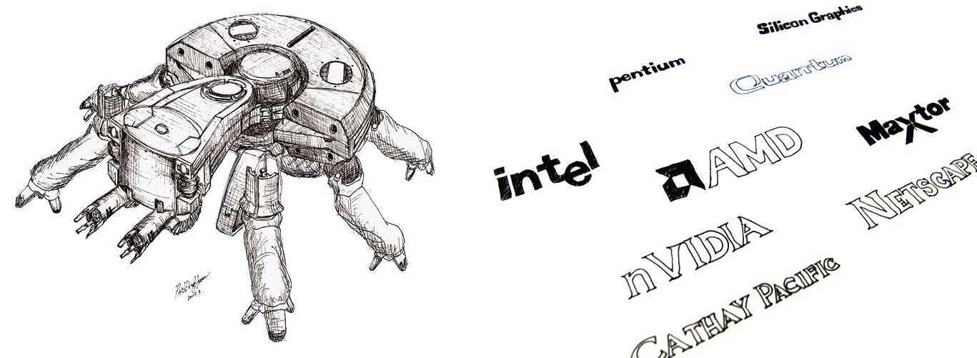
As a kid, I loved doodling a lot. My textbooks were always filled with characters and machines from animations. However, my favorite topic for doodling was company logos. Even though I didn’t know about ‘typography’, I fell in love with the systematic and harmonized beautiful letterforms of the logotypes. Since I was into computers, I loved drawing the logos of computer companies.
In college, I studied electrical engineering and worked as a software engineer. Then I went back to design school to study graphic design. With this mixed background, I have been creating iOS apps and have written an iOS programming book published in Korea.
Typeface Explorer (2008)
With my strong interest in typography, interactive media, and 3D space, I created the flash app ‘Typeface Explorer’ in 2008, with Adobe Flash and Papervision3D (3D engine for flash). I was exploring high-quality typeface rendering with vectors in varying scales. This was the beginning of my interest in typography on interactive digital media.
Typography Insight (2011)
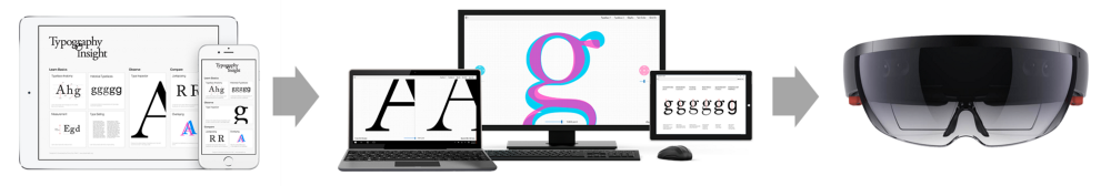
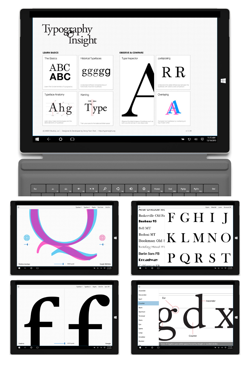
When the iPad was announced in 2010, I thought it would be a great platform for learning and playing with typefaces. I could imagine the power of being able to physically touch and interact with type on any scale. This was the beginning of my app Typography Insight which became my graduate thesis project at the Parsons School of Design MFA Design & Technology program. Originally I made the app for iPad, adding the iPhone version a few months later.
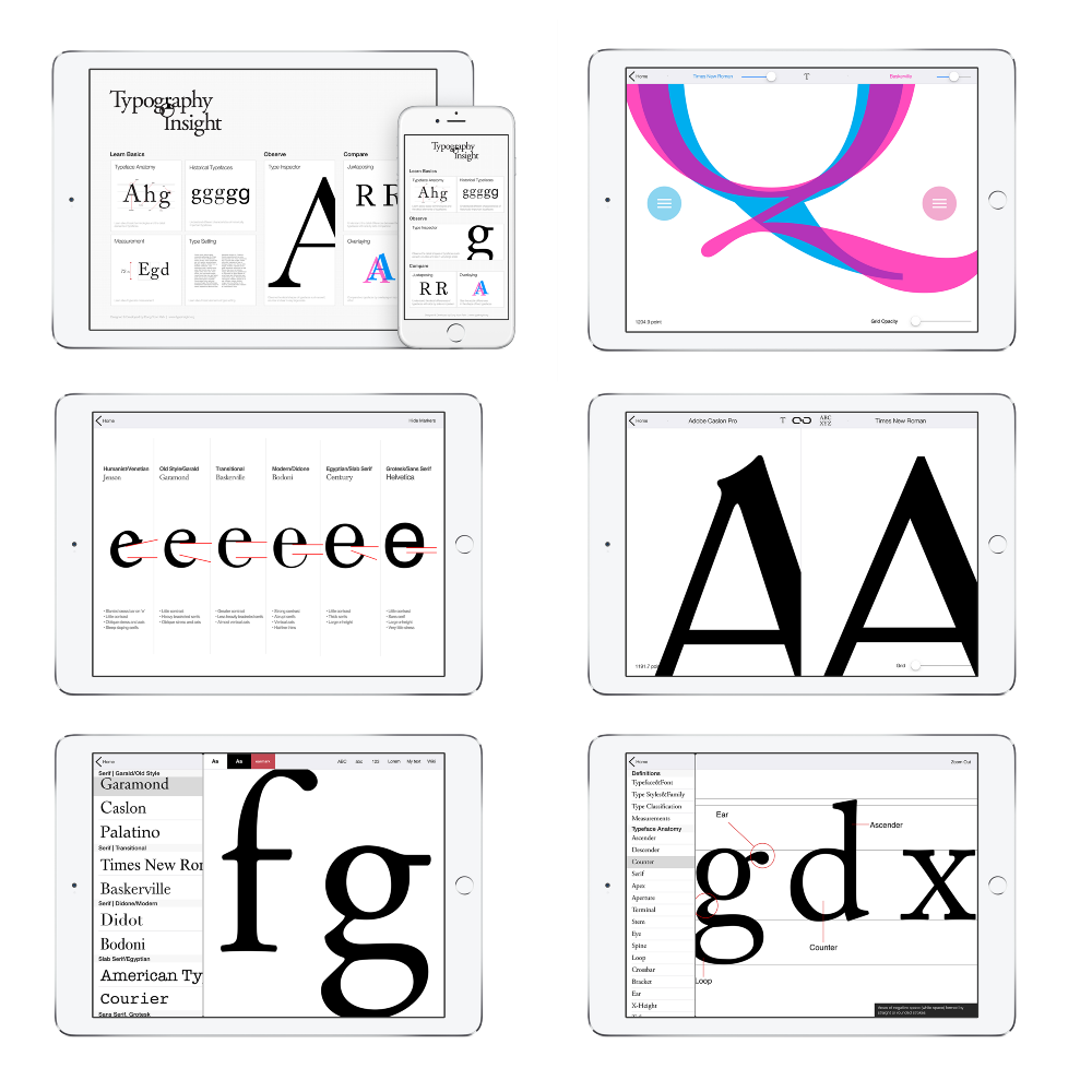
Typography Insight is a toolkit for learning and teaching typography. I published it in May 2011 with my graduation and it was featured on iTunes AppStore several times, ranked second in the US education category. I presented this project at AIGA/NY. It was reviewed in FastCompany, The Atlantic, and Gizmodo.
Introductory video https://youtu.be/ZSrdvc_ItBM
“Anyone who loves books, words, history, or fine art — even in the slightest bit — will find Typography Insight as intoxicating as Wikipedia and as fun as a video game.” — Fast Company
“Learning the subtleties of Helvetica and Garamond used to be a pain — but a sleek new app has made the process easier” — The Atlantic
“Typography Insight is sort of like an iPad typeface encyclopedia. Only encyclopedias are boring, and Typography Insight is beautiful and fun.” — Gizmodo
Bringing Typography Insight to Windows with Windows Bridge for iOS
I have been continuously updating Typography Insight over the past five years but didn’t have a chance to bring it to other platforms. Fortunately, Microsoft announced the open-source project Windows Bridge for iOS which allows iOS developers bring their apps to Windows using existing Objective-C code.
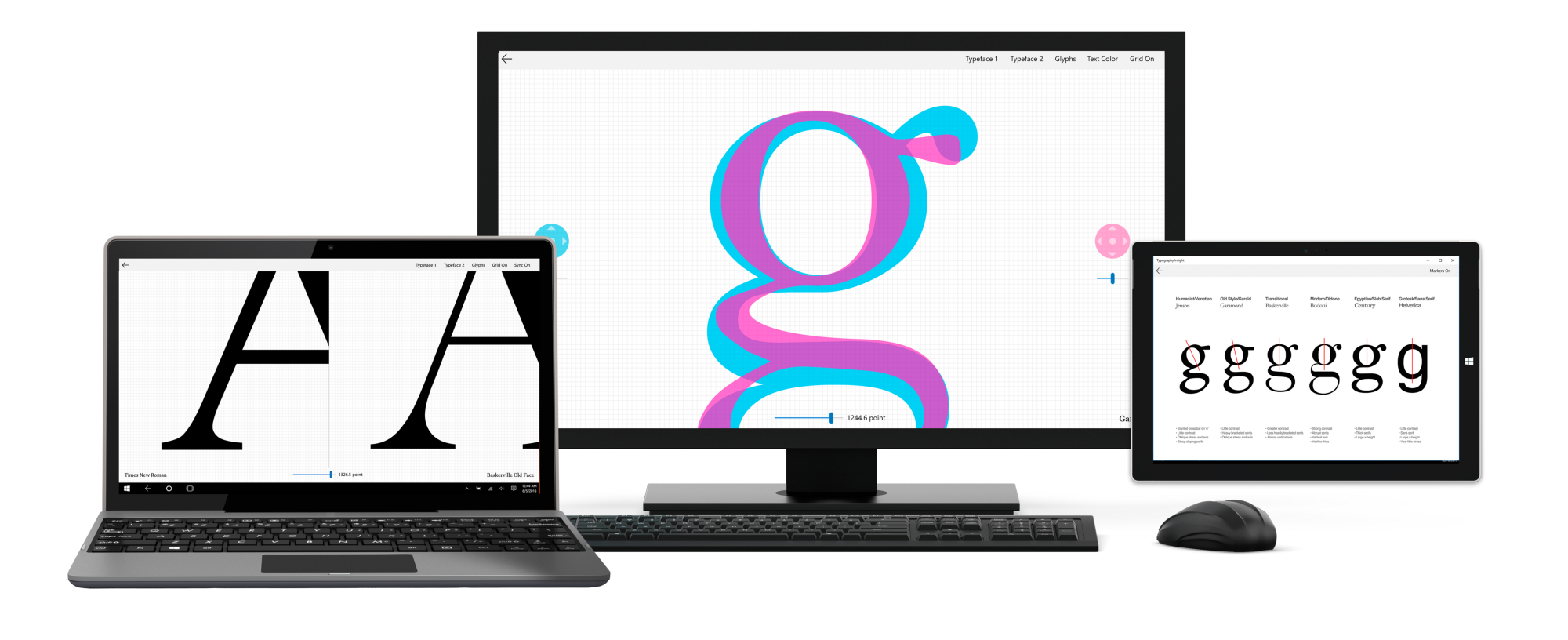
With Windows Bridge for iOS, I was able to bring Typography Insight to Windows. It was published to Windows Store in June 2016. Now it is running on Windows 10 desktop and tablet devices as a UWP (Universal Windows Platform) app.
Since Windows Bridge takes care of translating iOS’ UI controls and UX patterns into Windows versions, I didn’t have to worry about updating the visuals of the UI. It supports a keyboard and mouse as well as touch input. Luckily, AutoLayoutConstraints on iOS worked well on Windows which made it easy to support varying window sizes and different resolutions. The app was introduced as an example of Windows Bridge for iOS, at Microsoft Build 2016 developer conference.
Designing Typography Insight for HoloLens
When I first met HoloLens, I thought typography would not be a relevant topic in 3D space since typography has been all about flat 2D spaces— paper, books, screens, and print. However, as soon as I started putting type into 3D space with HoloLens, I realized that typography in a mixed-reality space could be really gorgeous! It has a totally different physicality compared to traditional display or paper media.
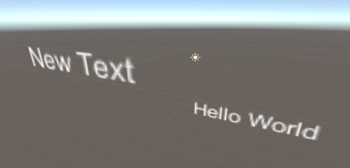
In HoloLens, the type is constructed as a hologram with light based on the additive color system. Since you can place type in the actual environment and the type is world locked, you can observe it from any angle just like real-life objects. The parallax effect between the type and the environment makes it even more magical, especially when there are multiple types layered in mixed reality space.
When we talk about typing in 3D space, we tend to think of extruded 3D text. However, besides some logotype designs or limited applications, I don’t think extruded 3D text gives us that much value. Extruded text degrades readability, especially for displaying information.
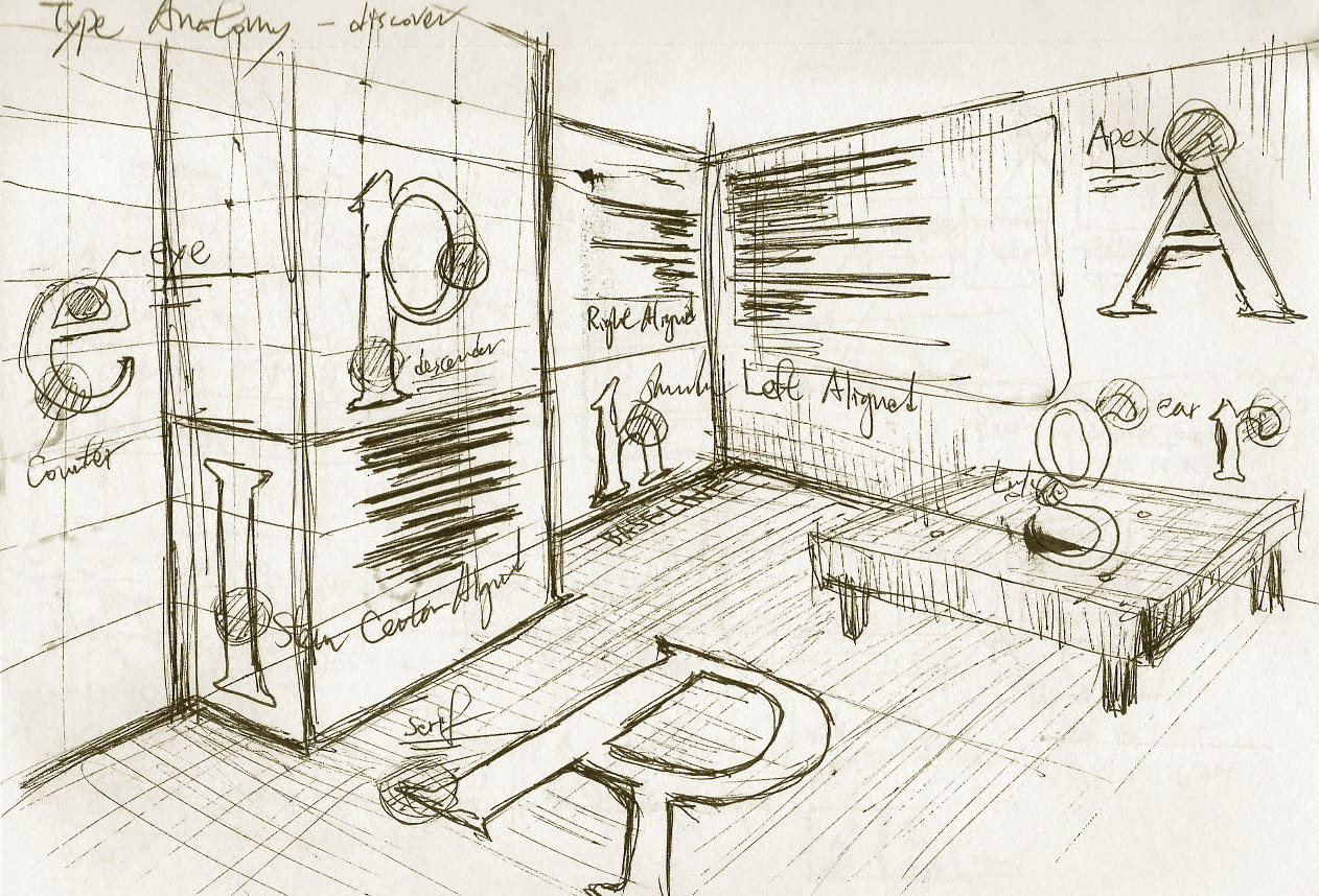
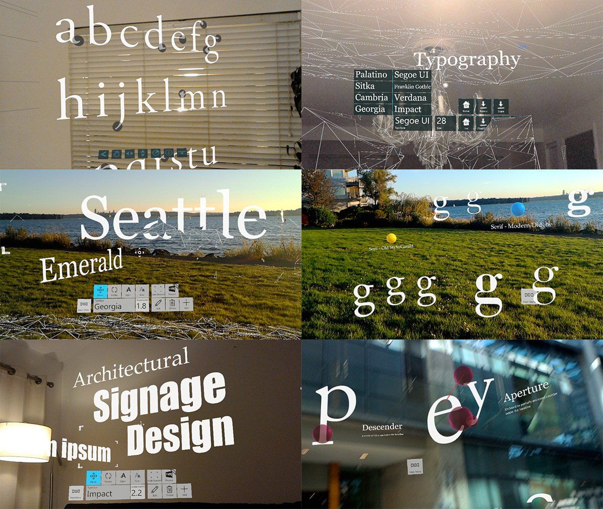
After some experiments, I started thinking about bringing the ‘Type Inspector’ feature from my original 2D Typography Insight app to a holographic experience. ‘Type Inspector’ allows you to observe and experiment with type in various scales. In HoloLens, I thought this could effectively become a toolkit for experimenting with types in mixed reality space, with different sizes, colors, and distances.
I was also interested in translating learning components such as ‘Historical Typefaces’ or ‘Typeface Anatomy’ into 3D space. Since ‘Historical Typefaces’ involves chronological order based on a type classification system, I thought I could visualize the timeline in 3D space.
Design Iterations
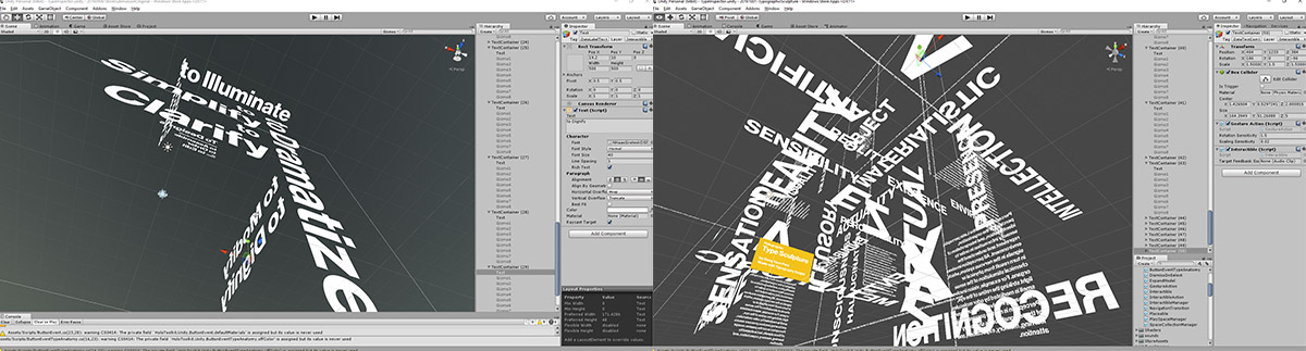
Using publicly available resources — HoloToolkit, Holographic Academy Samples, and Galaxy Explorer—I started constructing the UI and text objects. Initially, it took a long time for me to get used to the hierarchy and the relationships between the prefabs and scripts. Starting with box collider, I learned how to use Unity’s Animation Controller to build animated UI for font list menus. Since I didn’t know how to create shaders, I decided to use PNG images for some of the hover effects in the Typeface Anatomy scene.
The biggest challenges in the design process were scale and position. It was hard to imagine an object’s actual size and position until deploying and actually experiencing it in the device. I spent a lot of time finding the proper dimensions and positions for the objects.
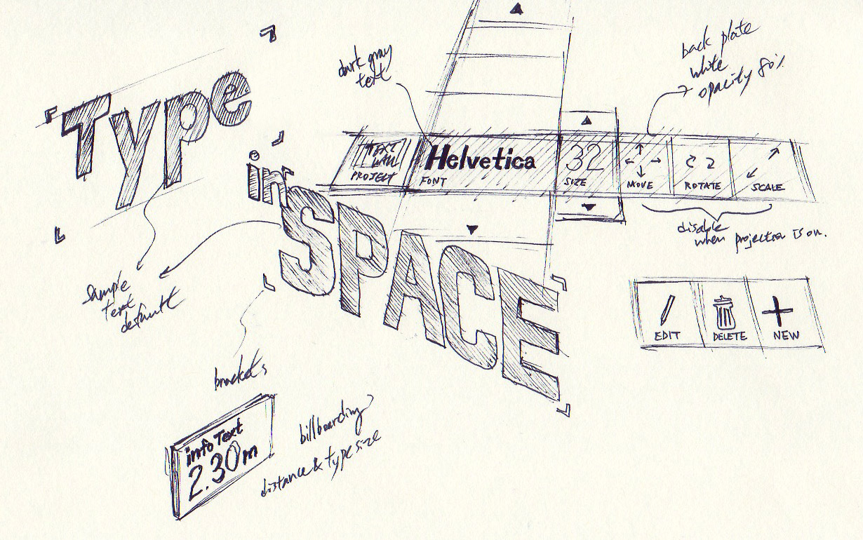
UX Elements — Toolbar UI
I used Unity’s cube primitives with UI Text and PNG 2D Sprites to construct the button toolbar interface. For the secondary menus, I used Unity’s Animation Controller with triggers to achieve an animated menu system on an air tap event. Tag-Along and Billboarding were important concepts to design this floating user interface. Tag-Along makes the object follow you. With Billboarding, you can make holograms always face toward you. Using these two techniques, I was able to create a floating toolbar that stays in the view frustum.
UX Elements — Gestures
For the manipulation gestures, I used Navigation and Manipulation gesture examples from the Holograms 211 tutorial. These gesture inputs are used to move, rotate and resize the type. A basic tap gesture is used for text objects or menu selection.
UX Elements — Spatial Mapping
Spatial Mapping is a unique and powerful capability in HoloLens. Using spatial perception capability we can place holographic objects in the real environment. In Typography Insight, I used Spatial Mapping to project and place text objects on the wall. Spatial Mapping prefab from HoloToolkit and Tap To Place example from Holographic Academy projects were very helpful to get basic environmental mesh and placing interaction. Currently, I am looking into ‘Plane Finder’ in HoloToolkit which provides advanced spatial understanding such as walls, floors, and tables.
UX Elements — Text Input
Currently, the system keyboard is only supported in 2D XAML mode. Because of this, there is an abrupt context change between exclusive 3D and 2D mode when using the keyboard input. The system keyboard has integrated voice input.
Publishing v1.0 to Windows Store
Publishing to Windows Store was straightforward. Since Windows Holographic apps are essentially UWP apps, the process was exactly same. Below is the intro video of the version 1.0.
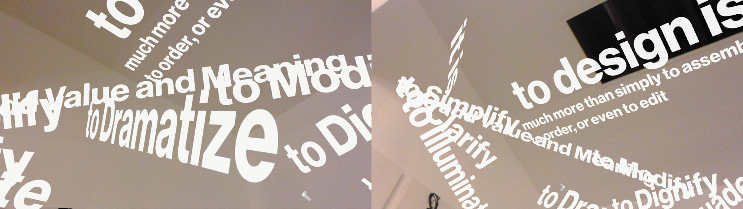
Experiment at Bellevue Arts Museum
One day, I went to Bellevue Arts Museum and I realized that the space was really beautiful. I wanted to do something with holograms and decided to build a spatial typographic composition. I quickly started some prototypes with layered typography and created this ‘Holographic Type Sculpture.’ Below is the mixed reality video captured at Bellevue Arts Museum.
Historical Type Timeline and Color Picker
In the latest update, I have added a ‘Type Timeline’ feature which I introduced above in this article: Type Explorer, 2008. In this feature, I explore the possibility of visualizing chronological data in three-dimensional space, leveraging depth. You can explore historically important typefaces from Old Style/Garald to modern Humanist Sans-Serif, with summary information. You can scroll this 3D list with the scroll gesture.
Together with this new feature, now you can change the color of the types using newly added color picker. I hope this color feature can help you experiment with types in mixed reality space.
Distance indicator, Save & Load scene
The app was already showing the distance information — the distance from HoloLens to the text object. However, it was hard to see this information since the distance information was displayed on the toolbar. In the latest update, I have added this distance information as an annotation close to the text object, together with the font size information.
The Save and Load feature is finally ready. Now you can save your layout composition and restore it later. These feature updates are available in the latest version of the Windows Holographic Store.
Tips: Getting Beautiful Type for HoloLens in Unity
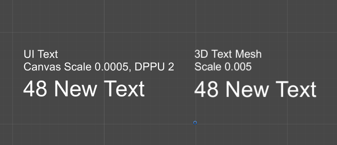
Text is the most important component in Typography Insight. To display text, there are two types of text components you can use in Unity — UI Text and 3D Text Mesh. Both are very blurry in default and you need to tweak some of the variables to get sharp high-quality text. For UI Text, Unity provided this guideline for HoloLens but I wanted to figure out more accurate scaling factors to get proper text size.
I did an experiment with a printed type ramp on the wall. From a 2-meter distance, using Typography Insight for HoloLens with a type ramp and debug menu, I overlaid and resized holographic text to match the physical one. With this experiment, I was able to find the proper scaling factor. (2-meter is the recommended comfort distance for placing holographic objects)
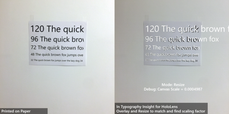
The scaling factors from this experiment are approximately 0.0005 for UI Text and 0.005 for 3D Text Mesh. Even though it might not be perfectly accurate, with these scaling factors, you can get the relevant type size which will be similar to the physical type size at a 2-meter distance. If you use this scaling factor, you can say 48pt type size at a 2-meter distance is same in Unity and Adobe Illustrator.
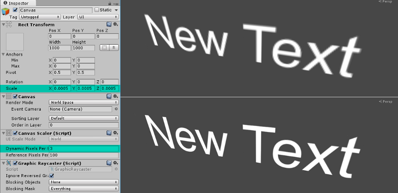
For UI Text, you can adjust the additional parameter ‘Dynamic Pixels Per Unit’ in Canvas to improve text rendering quality. However, if you increase this too much, you will get an unexpected type size and performance will degrade. With a scaling factor of 0.0005, a DPPU value between 2–3 gave me decent rendering quality.
*For further details on the text scaling factor, please refer to this README.md file in HoloToolkit. The font Scale and Font Sizes section describes how these values can be calculated by Points and Unity units.
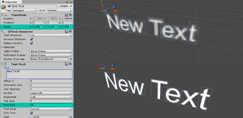
Below is the comparison between UI Text and 3D Text Mesh. As you can see, using these scaling factors, you can expect the exact size of text. This site will be also the same as the text from Illustrator or Photoshop.
As you can expect, type sizes that we’ve been using on PC or tablet devices (typically between 12–32pt) look quite small at a 2-meter distance. It depends on the characteristics of types but in general, recommended minimum type size for legibility without stroke vibration is around 20pt, based on the scaling factor introduced above. If your app is supposed to be used at a closer distance, smaller types could be used.
For the font selection, Segoe UI (the default font for Windows) works well in most cases. However, I would recommend avoiding using light or semi-light for the type sizes under 42 pt since thin vertical strokes will vibrate and it will degrade legibility. In general, modern fonts with enough stroke thickness work well. For example, Helvetica and Arial look gorgeous and very legible in HoloLens with regular or bold weights.
Other Stories
-

How to enable Passthrough for Mixed Reality – Meta Quest 3, Quest Pro, Quest 2
#Mixed Reality #Passthrough #Hand Tracking #MetaQuest #Quest3 #Quest2 #QuestPro To enable passthrough, follow these 3 steps: 1. Enable Passthrough in OVRCameraRig > OVR Manager Update Passthrough Support and Enable Passthrough 2. Add OVRPassthroughLayer script Add OVRPassthroughLayer component to the OVRCameraRig. Select Underlay to use the passthrough as a background. This will create augmented reality experience…
-
How AI Is Empowering Designers in Spatial Computing
AI has already created tremendous opportunities for designers working on traditional 2D applications and services. But what has excited me even more is how AI is fundamentally changing the way we design spatial computing experiences. The reason is simple: Spatial computing has always had a much higher barrier to entry. Unlike traditional 2D interaction design,…
-

Cosmic XR has won ‘Education Experience of the Year’ at The Polys 6th Annual Immersive Awards
Cosmic XR has won “Education Experience of the Year” at The Polys 6th Annual Immersive Awards today. The Polys, presented by the Academy of Immersive Arts & Sciences, recognize outstanding immersive experiences across XR. Cosmic XR is my solo passion project, combining my love for space, spatial interaction, and data visualization. I wanted to make…
-
How to use Meta Quest 2/Quest Pro with MRTK3 Unity for Hand Interactions
With the support of OpenXR, it is now easy to use MRTK with Meta Quest devices. These are overall steps to set up the environment. If you use a PC, you can preview Unity’s game mode on the headset in real time which helps you iterate fast. Unfortunately, Mac does not support this live preview,…
-
Designing Type In Space for HoloLens 2
Background As a designer passionate about typography and spatial computing, I’ve long been captivated by the idea of placing beautiful type into real-world space. With Microsoft HoloLens, you can anchor holographic objects in your physical environment — on tables, walls, or in mid-air — and walk around them just like real objects. My journey began…